INTRODUCTION
………………………………………………………..
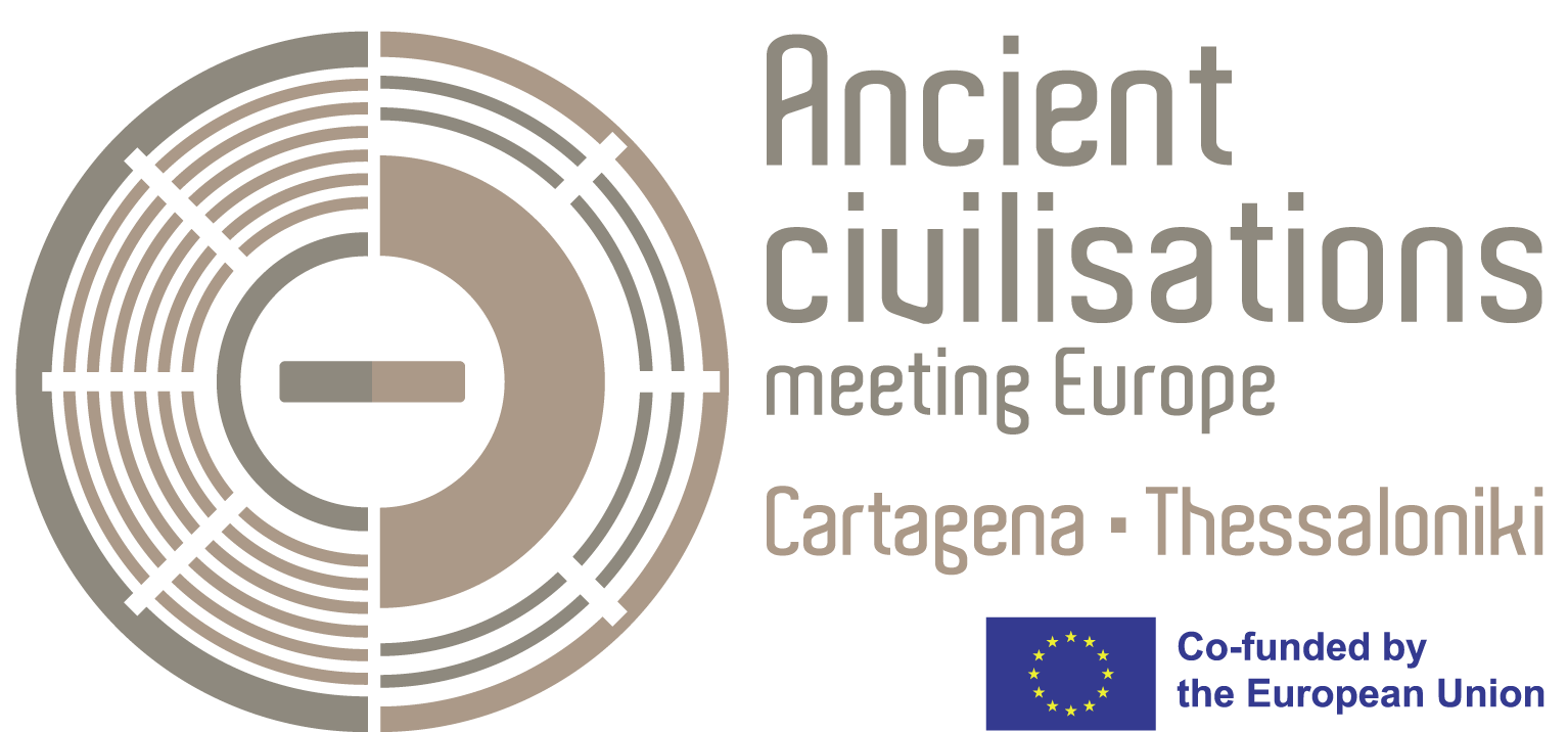
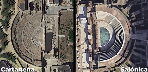
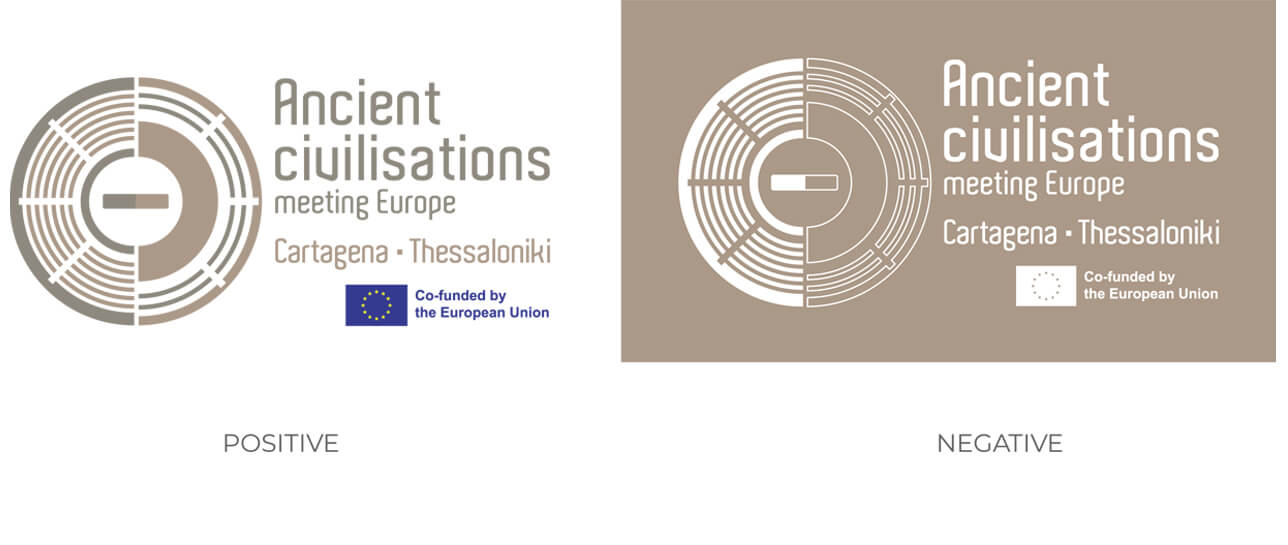
For the design of this logo, we sought common elements shared by the cities of Cartagena and Thessaloniki (Salonica). Among all the inspiration sources that we handled, we opted for the iconography of the theaters of the cities involved in the project, as both constructions date back to the
Roman era and are graphically recognizable in our logos.
Based on their shapes, we eliminated the most complex elements so as to keep their essence, putting the focus on basic geometric representation. This contributes to a modern and aesthetically very attractive logo.
When placing the two theatre-like figures, we decided to place them one in front of the other, making a circle that represents both the Spanish initial letter “C” for “Cartagena” (on the left), the initial Greek letter “Θ” (theta) for Thessaloniki/Θεσσαλονίκη (in the centre), and simultaneously the letter “E” for Europe (both on the right and on the left).
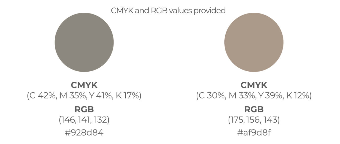
The color range of the logo draws from the land and stone tones present in the theatres and their surroundings.
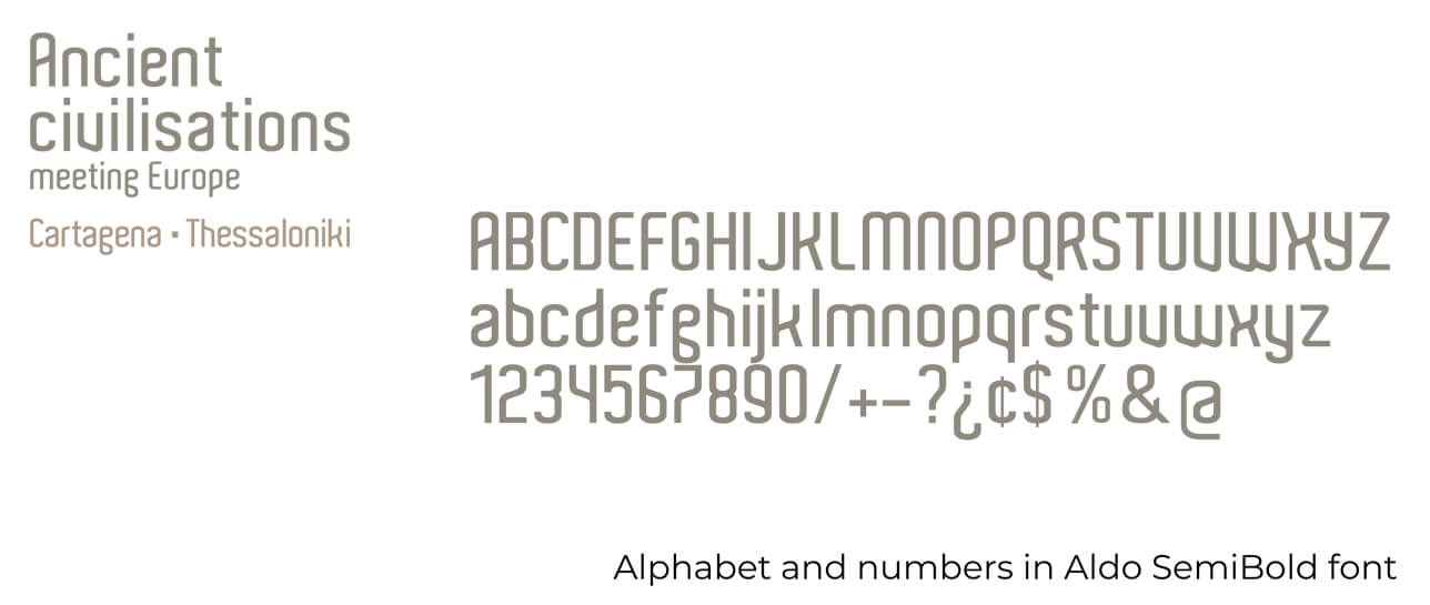
Finally, we used a current, very legible typography called “Aldo”, which contrasts with the historical weight of what we represent in this logo about ancient civilizations.


THE BRAND
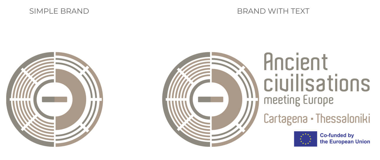
VERSIONS
CORPORATE
COLORS
TYPOGRAPHY
